Simplifying the Payment Experience at Shaadi.com
Simplifying the Payment Experience at Shaadi.com
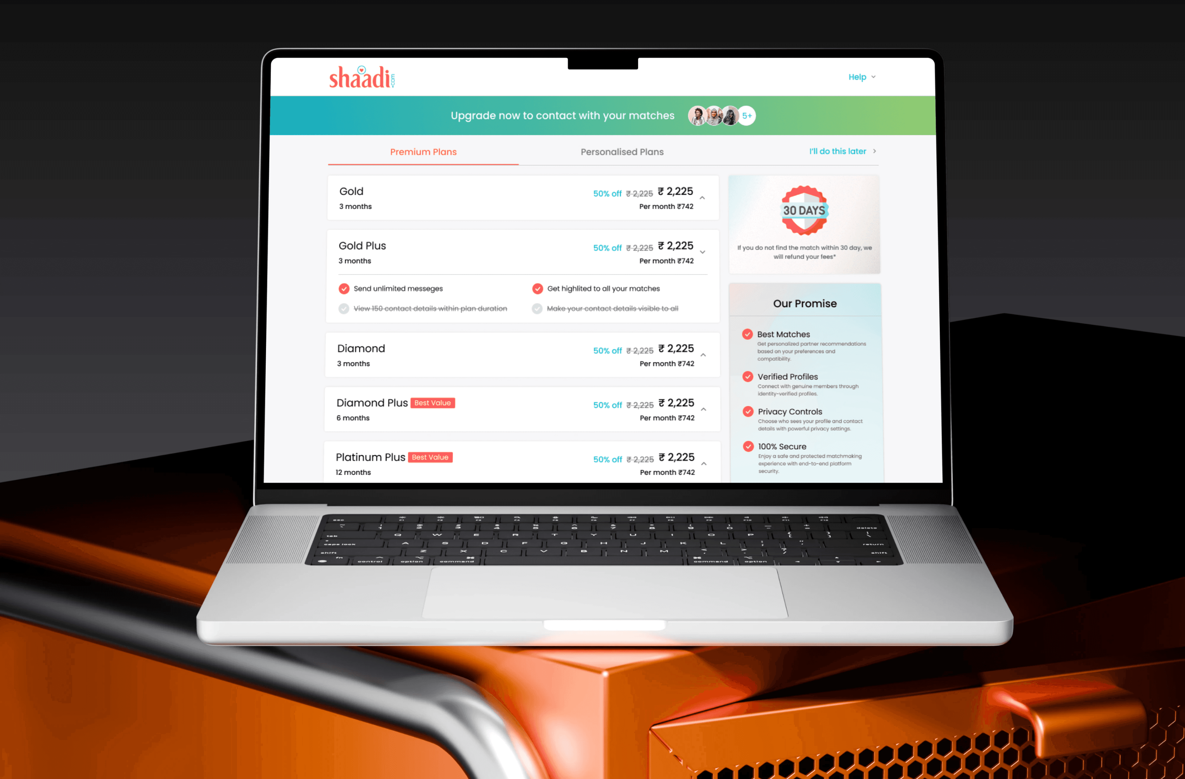
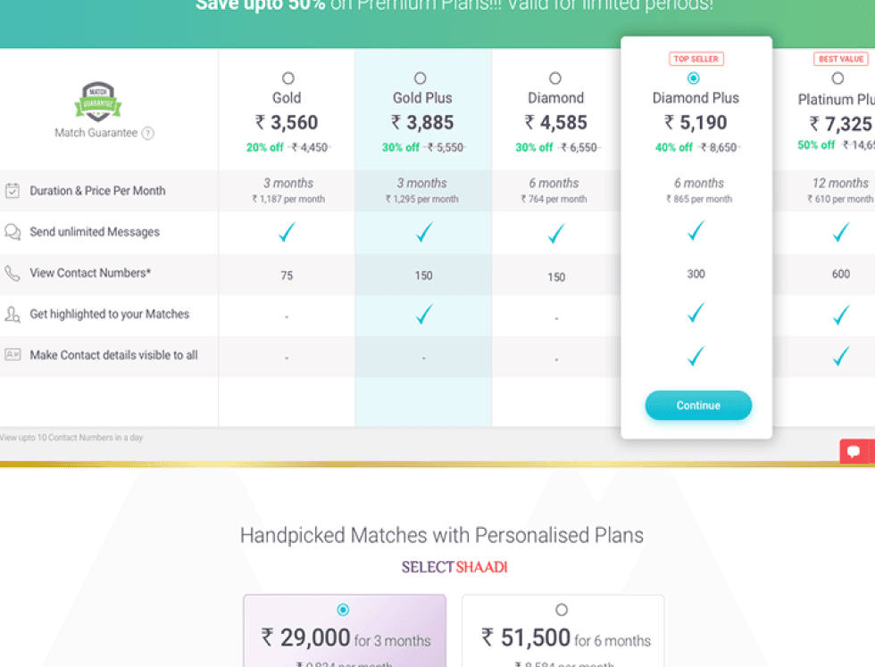
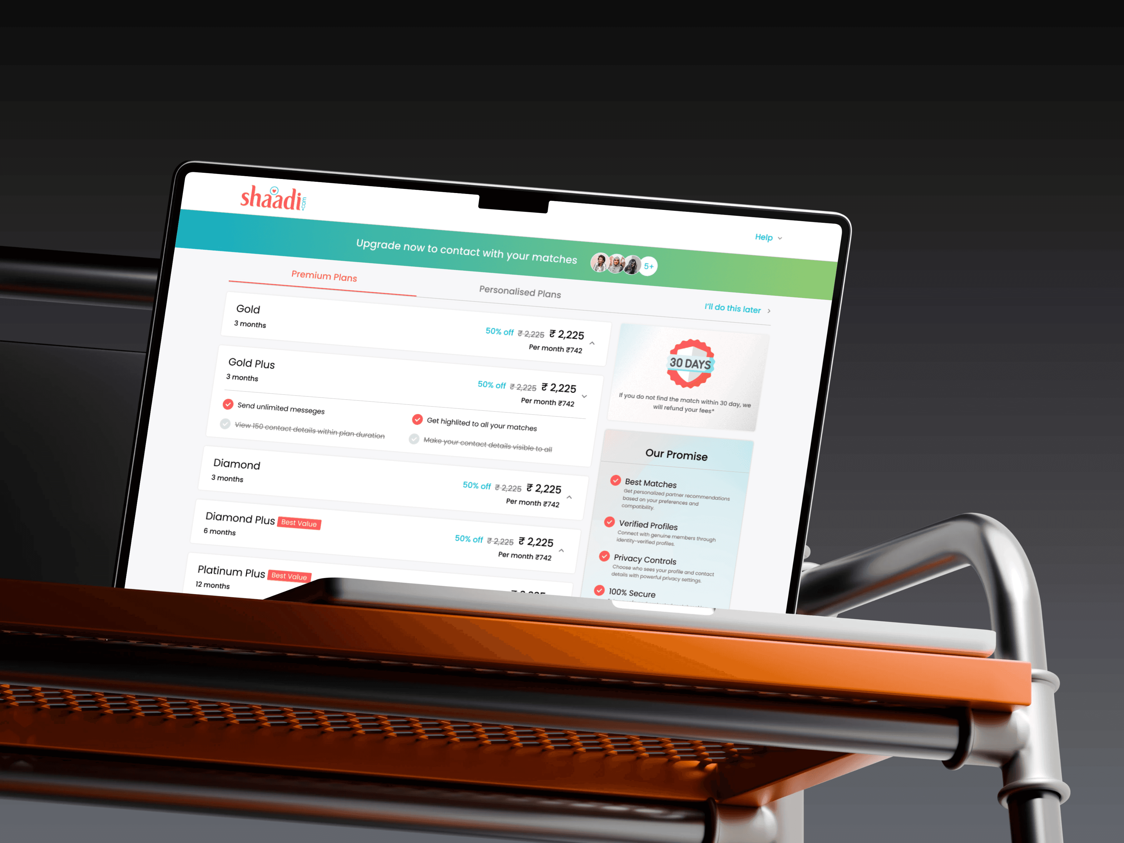
In 2017, while working as a UX Designer at Shaadi.com, I encountered a key user friction point the subscription payment page. Users consistently reported that the experience was overwhelming and unclear. With multiple plans listed in a crowded layout and no clear way to compare them, users often:
Dropped off without completing a purchase
Defaulted to the cheapest plan, not understanding the benefits of higher-value options
It was like walking into a candy store with too many choices — users froze instead of buying.
Company
Shaadi.com
Company
Shaadi.com
Location
Mumbai, India
Location
Mumbai, India
Industry
Matchmaking, Dating
Industry
Matchmaking, Dating
My Role
UX Designer
My Role
UX Designer
Team
Growth and Monetization Team
Team
Growth and Monetization Team
Project Duration
5 Days
Project Duration
5 Days
Challenge
Challenge
simplify the subscription experience so users could easily understand their options and feel confident in making a purchase — especially one that offered more value to both them and the business.
My specific design goals were to:
Reduce cognitive overload by simplifying plan presentation
Help users quickly compare options and see value
Encourage higher-tier plan selection through better visual communication and benefit clarity
Ultimately, increase conversion rates and revenue per visitor
Result
Result
the main goal of this task was to simplify the page and increase the conversion rate, we also observed a significant improvement in Revenue Per Visitor (RVP).
the main goal of this task was to simplify the page and increase the conversion rate, we also observed a significant improvement in Revenue Per Visitor (RVP).
19.8%
Conversion rate
19.8%
Conversion rate
5.1
Revenue per visitor
5.1
Revenue per visitor
14.7%
Reduce in drop rate
14.7%
Reduce in drop rate
Process
Process
Empathize & Understand Users
Empathize & Understand Users
Reviewed existing user feedback and analytics to identify pain points
Noticed a trend of confusion and indecision at the payment step
Conducted a competitive audit of how top-performing platforms displayed plans
Reviewed existing user feedback and analytics to identify pain points
Noticed a trend of confusion and indecision at the payment step
Conducted a competitive audit of how top-performing platforms displayed plans
Define the Problem
Define the Problem
Users couldn’t easily compare plan features side-by-side
Layout lacked visual hierarchy — benefits weren’t obvious
Too many choices with no guidance led to decision fatigue
Users couldn’t easily compare plan features side-by-side
Layout lacked visual hierarchy — benefits weren’t obvious
Too many choices with no guidance led to decision fatigue
Ideate & Design
Ideate & Design
Created wireframes with three clear, side-by-side plans
Used visual emphasis (highlighted plan, icons, callouts) to guide choices
Added value-focused messaging for each plan
Improved layout to reduce scrolling and focus user attention
Created wireframes with three clear, side-by-side plans
Used visual emphasis (highlighted plan, icons, callouts) to guide choices
Added value-focused messaging for each plan
Improved layout to reduce scrolling and focus user attention
Test & Iterate
Test & Iterate
Implemented changes via A/B testing with real users
Monitored behavior and purchase patterns
Implemented changes via A/B testing with real users
Monitored behavior and purchase patterns

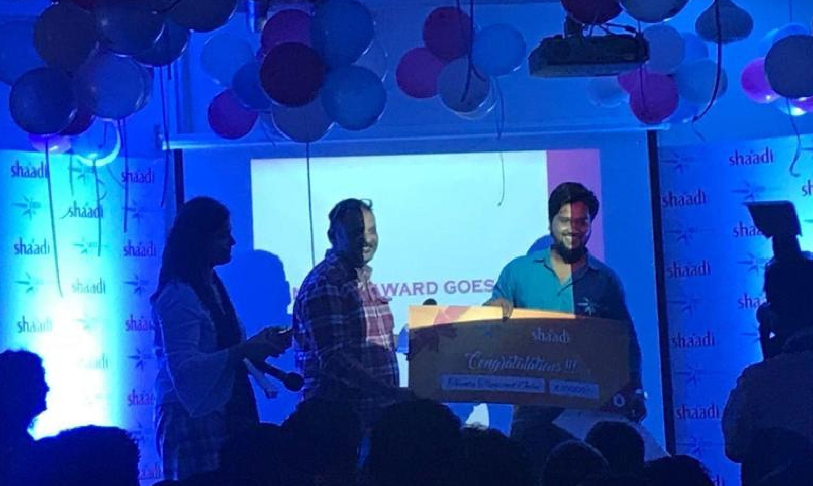
Lesson and Reward
This project proved to be both an invaluable learning experience and exceptionally rewarding. Its success directly contributed to my promotion to a Senior position and earned me the annual award for outstanding performance in driving significant revenue growth through strategic design changes.
This project proved to be both an invaluable learning experience and exceptionally rewarding. Its success directly contributed to my promotion to a Senior position and earned me the annual award for outstanding performance in driving significant revenue growth through strategic design changes.
More options aren't always better — clarity beats quantity
Value communication is key to guiding user decisions
Even high-impact business goals (like revenue) are best solved by empathizing with users and reducing friction in their journey
More options aren't always better — clarity beats quantity
Value communication is key to guiding user decisions
Even high-impact business goals (like revenue) are best solved by empathizing with users and reducing friction in their journey
Final Thought
This project reminded me that great UX isn't about flashy design — it’s about making decisions easier, faster, and more confident for users. And when you solve for users, business wins follow naturally.
"This project reminded me that great UX isn't about flashy design — it’s about making decisions easier, faster, and more confident for users. And when you solve for users, business wins follow naturally."